Category
UI&UX
Type
Team work
Client
Vitalysis
▸Project Background
To create an application that will allow diabetes patients to visualize and improve overall health.
Vitalysis offers a unique telemedicine platform that helps users easily track their blood sugar, diet, and sleep. As a one-stop shop, Vitalysis allows patients to monitor and easily create visualizations of their data and health that they can share with their practitioners.
My role as UX/UI designer
I was one of the UI/UX designers in Vitalysis, led by our lead designer Hadia Admin. As the information architecture build by the other two designers, I created user interface design system, including iconography, typography, color selection, component, and template design, designed wireframes and prototypes. Researched and analyzed current trends to develop cohesive user interfaces.
▸Defining the Problem
How do we make it easier for diabetics to track both food and blood sugar, and connect this information to the doctor?
Diabetes is difficult to manage when, for some, even the slightest disturbance in sugar levels can cause damage to vital organs. And people don’t enjoy having to keep track of their food and sugar levels. Why would they, when all they want is to eat like anyone who doesn’t have to worry. It shouldn’t be that hard, but it just is.
▸Target Analysis
Who are they?
With our key findings, it is easy to recognize how easy it is to grow frustrated with the entire process of tracking. How do we make it so that the user remembers that they need to track their sugar before eating, several times a day for more accurate measurements and therefore getting more accurate insulin doses? How do we make it so that there is little to no pain in tracking food that is eaten on the go, or that is not pre-prepared, or that is ethnic without any ingredient information? How do we get this information to the doctor without the patient needing to come in often?
Pain points & User Needs
Insight 1
“I sometimes eat before taking blood sugar measurements.”
Sometimes, with delicious food around, and people eating, it seems that some patients just want to eat. They simply forget to take their blood sugar.
Insight 2
“Tracking food is hard because I have to think about how many calories are in it.”
Through our user interviews, we realized that this is a common problem, especially with people who cook at home, or with ethnic foods, where calories are not clearly written out. The patient has to think about what they put in the food, and in many cases, they just don't know. This causes frustration, and the patient decides not to report.
Insight 3
“I am scared of doctors and the process.”
Some of the users simply hate the forms involved with tracking their blood sugar, and they dislike going to the doctor, finding that it is not a friendly and comfortable experience.
▸UI/UX Design
Information Architecture
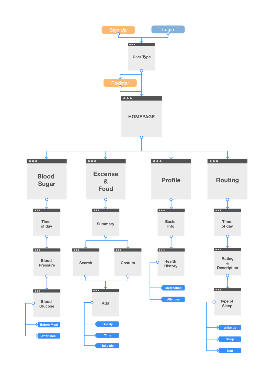
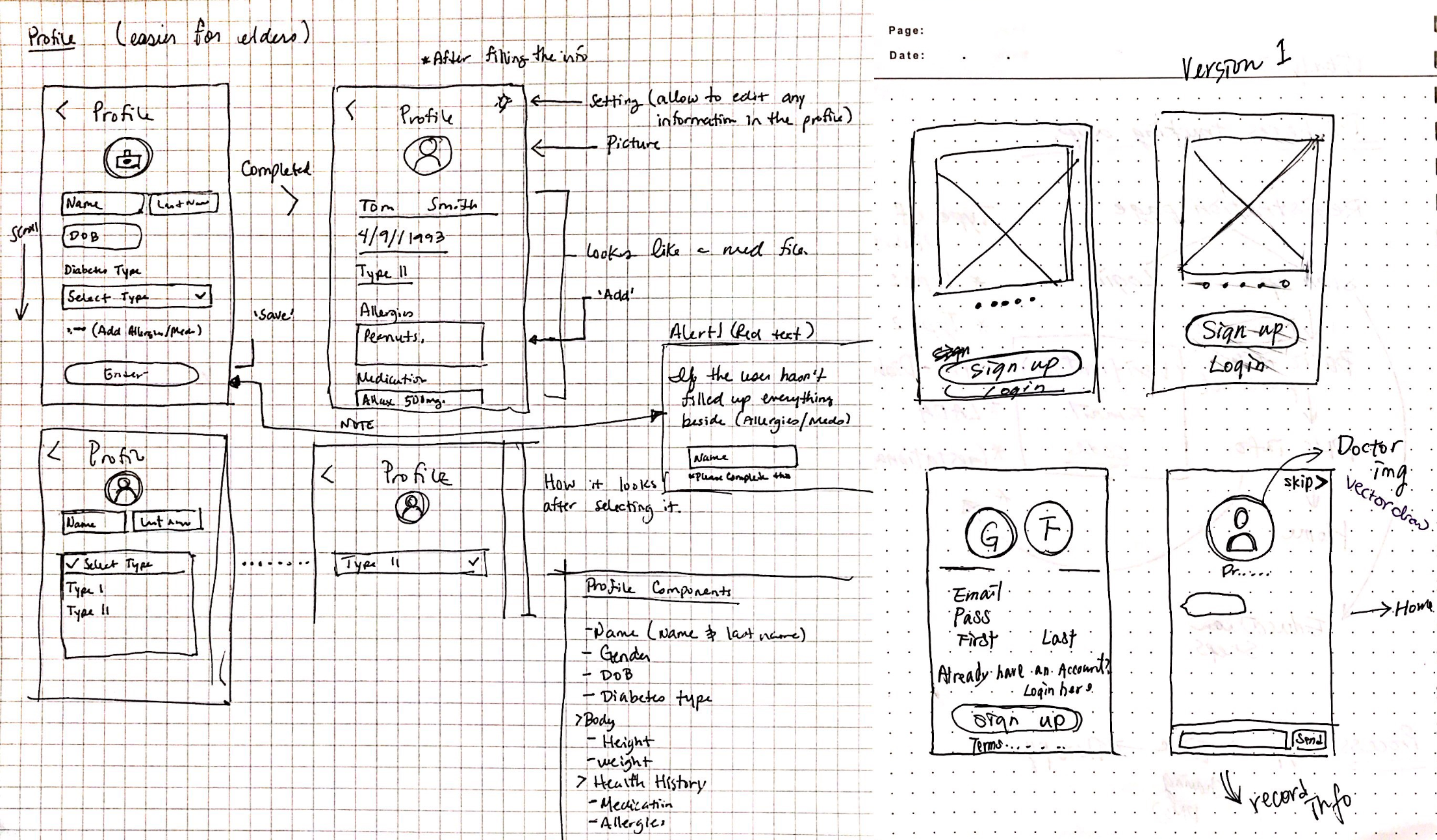
Sketches
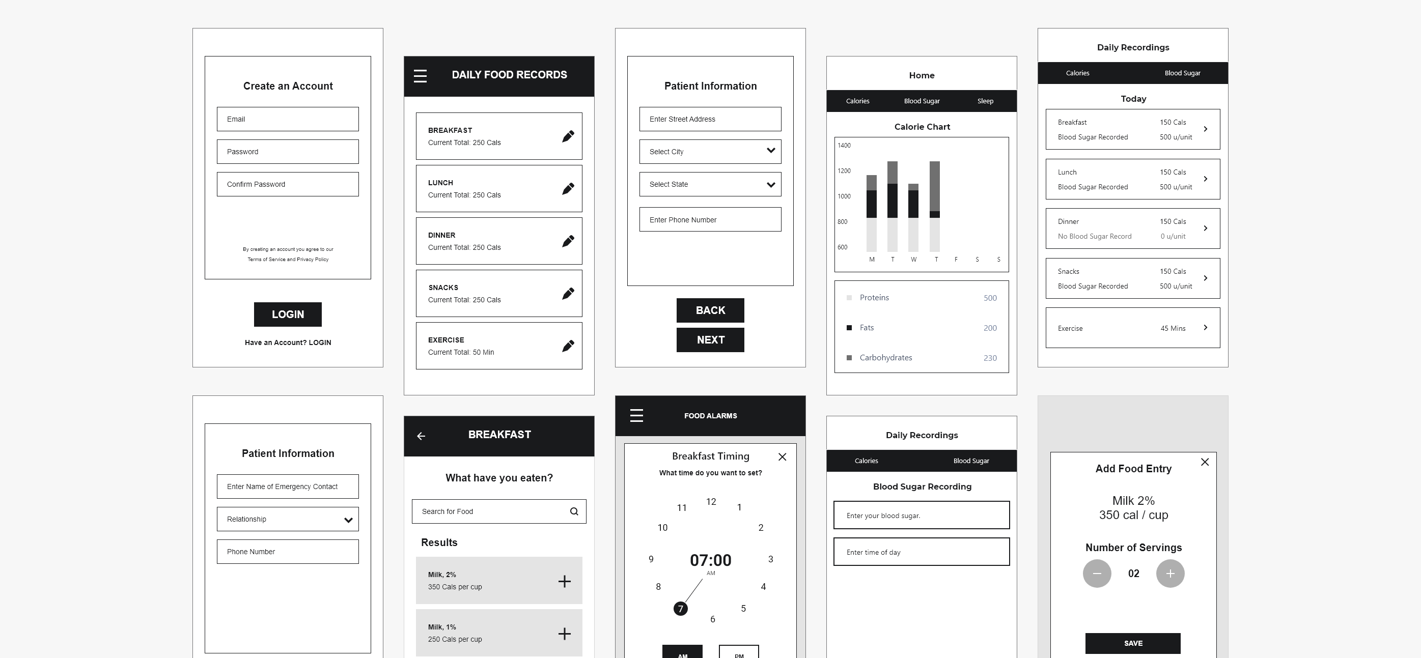
Wireframes & Testing
After that, chosen ideas were rendered using Adobe XD into low fidelity wireframes. We did user testing to understand what areas were okay to move forward with, and where work was needed. These were the areas that were re-worked:
Idea 1: MyFitnessPal Style Food Tracking
Rationale: This is a fairly well known way of tracking food on the go. Many applications follow this method. Reason for Failure: You still have to understand what calories are in the food you are eating more or less. It's not as painless as it could be.
Idea 2: Having patient set up every alarm needed for food and blood sugar tracking
Rationale: To give the patient full control of when they would be reminded, based on when they eat. Reason for Failure: The design easily became far too cluttered as the user would have to set several alarms up each day. Not user friendly with having to do this everyday.
(Other Changes) Redesign of Registration Process:
An overall redesign was done for the registration process to make it more friendly. We went with an idea mentioned in the sketches; the chatbot, in an attempt to create a more personalized approach to filling out the initial profile.
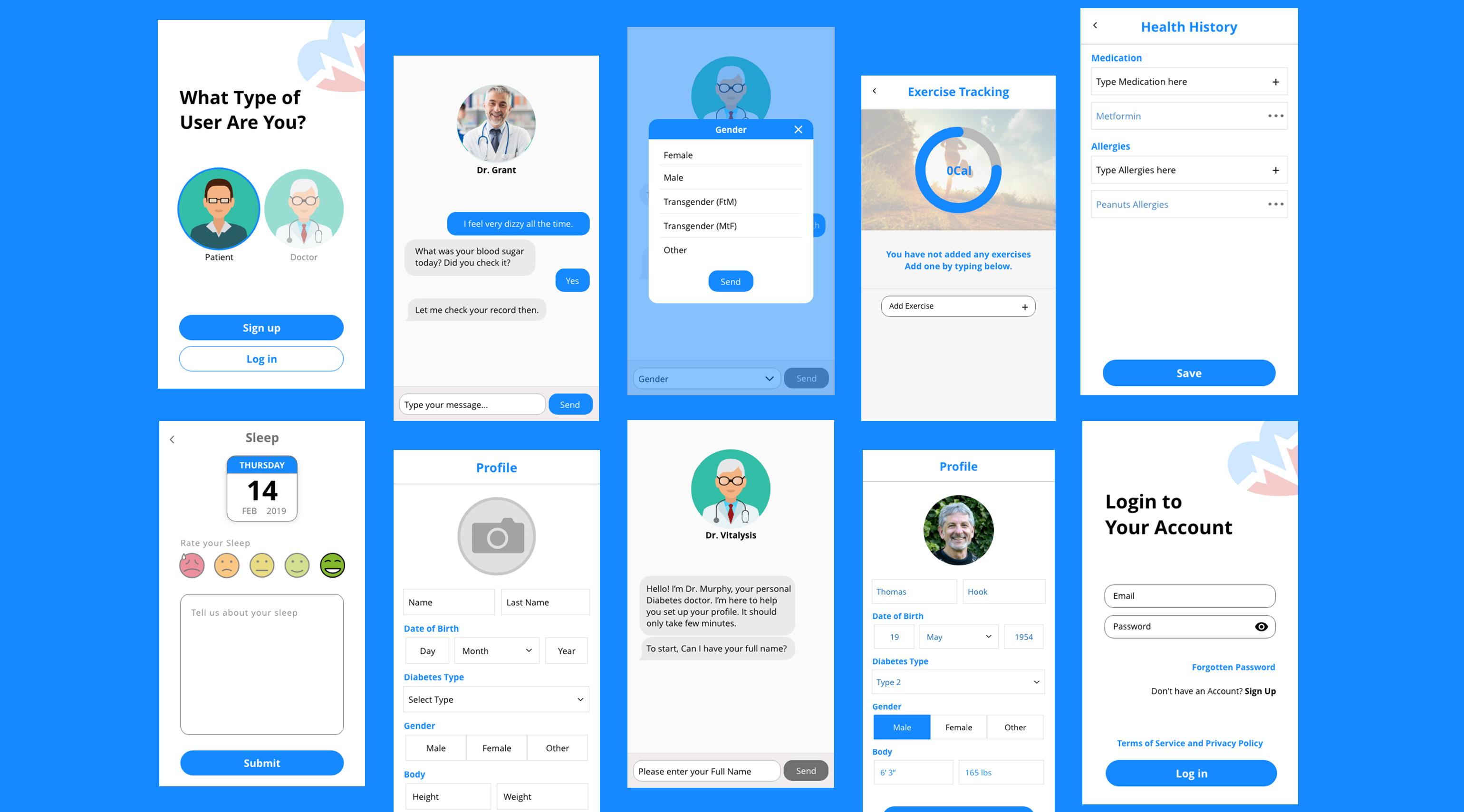
High Fidelity Wireframes & Design Decisions
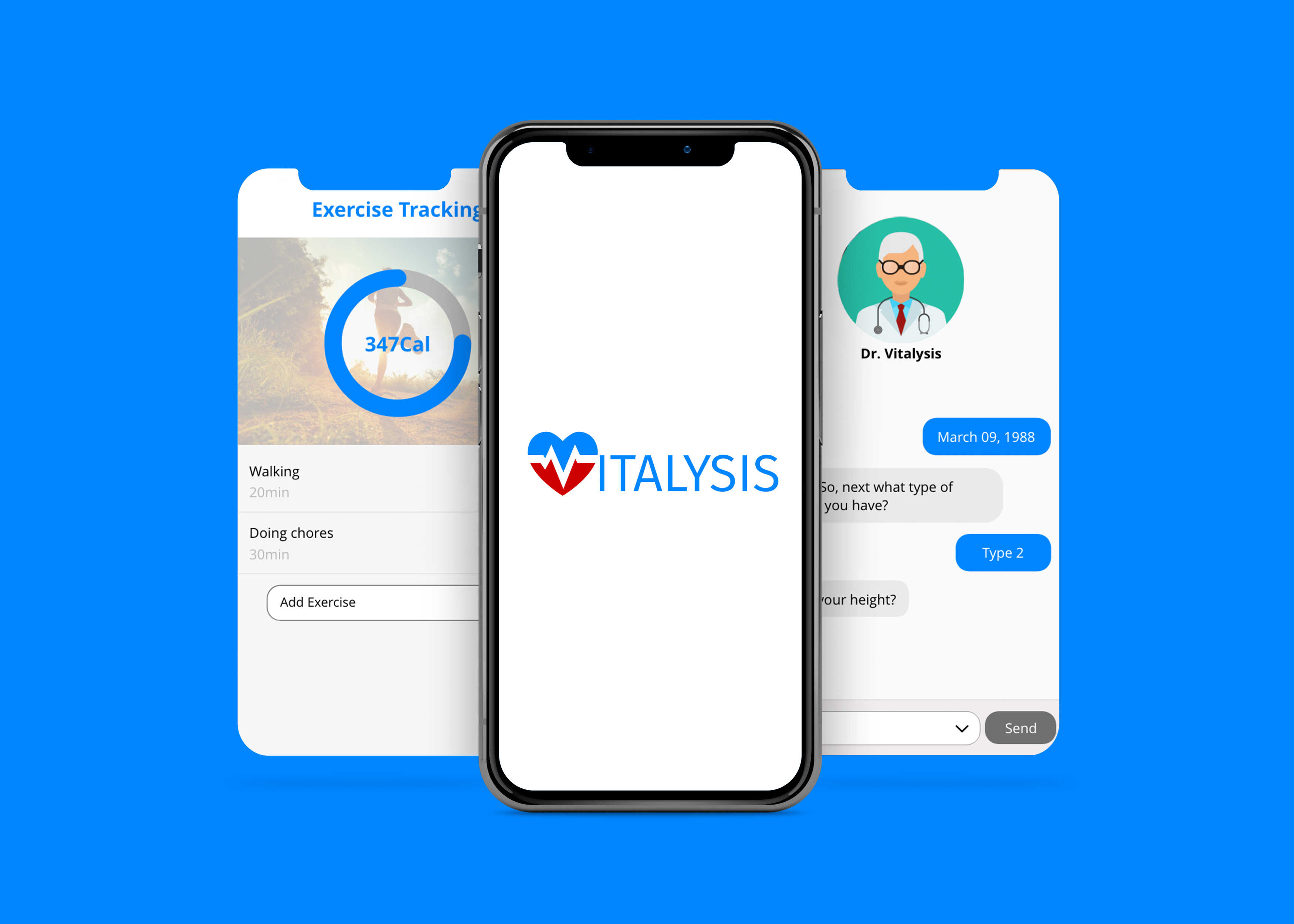
1. Augmented Reality approach to food tracking.
Action: Using an API to allow the user to take pictures of their food, and image recognition to track what they eat.
Test result: The time to track their food lowered significantly. Users were vocally pleased with this.
2. Chatbot interface recording profile information.
Action: A chatbot would walk the patient through the process of entering everything into their profile instead of a long form.br> Test results: Users enjoyed being able to chat with the bot rather than going through the forms. Overall less mistakes were made in entering values into fields as well.
3. Light Notifications.
Action: Alarm system as present in Android phones was the design used for setting alarms.br> Test results: Most users knew and understood how these alarms worked, and were able to set alarms for the week within seconds.
4. Messaging system with doctor
Action: Inserted option to contact doctor regarding concerns.
Test results: Users were happy with not having to call into front desk of clinic, and felt more at ease with being able to share their concerns without needing to make appointments.
5.Prioritizing error prevention over ease of use.
Action: Users were not given the ability to edit their blood sugar recordings, merely able to create new entries.
Test results: This enabled more accountability in users to not take back the recordings already done.
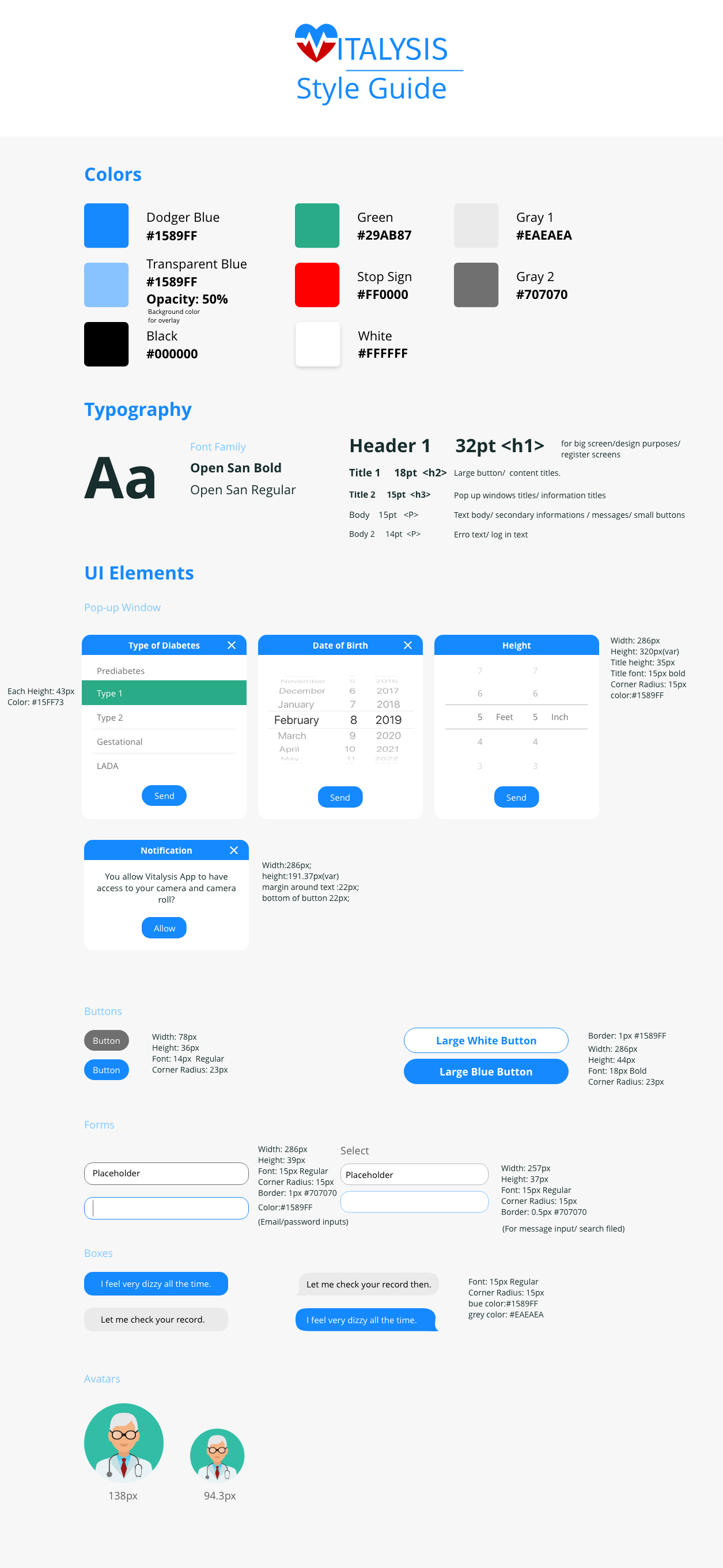
Style Guide
▸The Impact
Designs are set to be included in the application coming fall 2019
In our presentation to Vitalysis founders and stakeholders, we received extremely positive feedback. This patient side application is now in development, and slated for a release in the fall of this year. In the meantime, we are now approved to move forward with designing the clinic-facing application as Vitalysis plans to push forth into becoming a full tele-medicine application in the future. Our team will be working on applications with various services that Vitalysis will offer in the future.
▸Reflection
Healthcare needs to take steps towards friendly design.
Pouring through various existing applications in order to gain inspiration, I realized that healthcare has a long way to go before it is seen as user friendly enough to remove the intimidation behind it. Healthcare should be easy for users young and old. People attempting to be healthy should not be afraid of the processes. The only way we get there in the future, is to design user experiences that create not only ease of use, but ease of mind as well.